2024/10/3大约 16 分钟
05.骨架类组件
5.1 Scaffold
Scaffold是一个路由页的骨架,我们使用它可以很容易地拼装出一个完整的页面,它包含:- 一个导航栏
AppBar - 一个抽屉菜单
Drawer - 一个底部导航
BottomAppBar,BottomNavigationBar - 右下角有一个悬浮的动作按钮
FloatingActionButton
- 一个导航栏
AppBar是一个Material风格的导航栏,通过它可以设置导航栏标题、导航栏菜单、导航栏底部的Tab标题等
AppBar({
  Key? key,
  this.leading, //导航栏最左侧Widget,常见为抽屉菜单按钮或返回按钮。
  this.automaticallyImplyLeading = true, //如果leading为null,是否自动实现默认的leading按钮
  this.title,// 页面标题
  this.actions, // 导航栏右侧菜单
  this.bottom, // 导航栏底部菜单,通常为Tab按钮组TabBar
  this.elevation = 4.0, // 导航栏阴影
  this.centerTitle, //标题是否居中
  this.backgroundColor,
  ...   //其他属性见源码注释
})

TabBar({
  Key? key,
  required List<Widget> tabs,    // tab组件集合,一般使用Tab对象,也可以是其他的Widget
  TabController? controller,    //TabController对象
  bool isScrollable = false,    //是否可滚动
  EdgeInsetsGeometry? padding,    //设置选中Tab指示器间距,默认值为 EdgeInsets.zero
  Color? indicatorColor,    //指示器颜色
  bool automaticIndicatorColorAdjustment = true,    //是否自动调整indicatorColor
  double indicatorWeight = 2.0,    //指示器高度
  EdgeInsetsGeometry indicatorPadding = EdgeInsets.zero,  //底部指示器的Padding
  Decoration? indicator,    //指示器decoration,例如边框等
  TabBarIndicatorSize? indicatorSize,  //指示器大小,TabBarIndicatorSize.label 跟文字等宽,TabBarIndicatorSize.tab 跟每个tab等宽
  Color? dividerColor,   // 分隔符颜色
  Color? labelColor,      //选中label颜色
  TextStyle? labelStyle,    //选中label的Style
  EdgeInsetsGeometry? labelPadding,    //每个label的padding值
  Color? unselectedLabelColor,    //未选中label颜色
  TextStyle? unselectedLabelStyle,    //未选中label的Style
})Drawer- Scaffold的drawer和endDrawer属性可以分别接受一个Widget来作为页面的左、右抽屉菜单。如果开发者提供了抽屉菜单,那么当用户手指从屏幕左(或右)侧向里滑动时便可打开抽屉菜单
Drawer({
    super.key,
    this.backgroundColor,
    this.elevation,
    this.shadowColor,
    this.surfaceTintColor,
    this.shape,
    this.width,
    this.child,
    this.semanticLabel,
    this.clipBehavior,
})FloatingActionButton是Material设计规范中的一种特殊Button,通常悬浮在页面的某一个位置作为某种常用动作的快捷入口,如新建项目中页面右下角的"+"号按钮- 可以通过
floatingActionButtonLocation属性来指定其在页面中悬浮的位置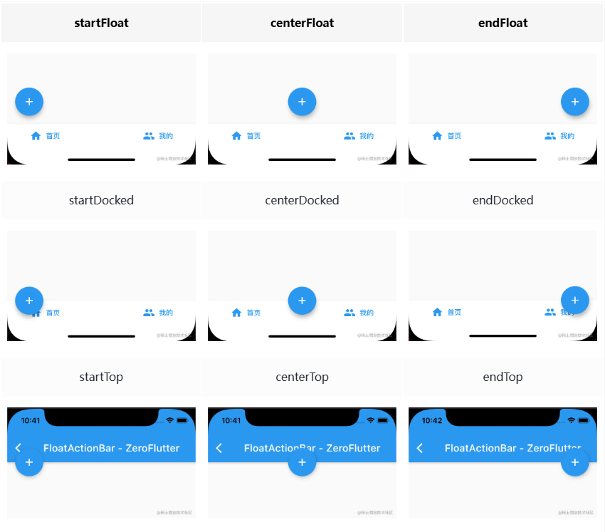
- 可以通过
FloatingActionButton({
    super.key,
    this.child,
    this.tooltip,
    this.foregroundColor,
    this.backgroundColor,
    this.focusColor,
    this.hoverColor,
    this.splashColor,
    this.heroTag = const _DefaultHeroTag(),//在 material 的设计规范里,每个屏幕只能有一个悬浮按钮,如果多个的话,设置不同的heroTag,解决标签冲突
    this.elevation,
    this.focusElevation,
    this.hoverElevation,
    this.highlightElevation,
    this.disabledElevation,
    required this.onPressed,
    this.mouseCursor,
    this.mini = false,
    this.shape,
    this.clipBehavior = Clip.none,
    this.focusNode,
    this.autofocus = false,
    this.materialTapTargetSize,
    this.isExtended = false,
    this.enableFeedback,
})BottomAppBar可以和FloatingActionButton配合实现“打洞”效果,BottomAppBar的shape属性决定洞的外形,打洞的位置取决于FloatingActionButton的位置
BottomAppBar({
    super.key,
    this.color,
    this.elevation,
    this.shape,
    this.clipBehavior = Clip.none,
    this.notchMargin = 4.0,
    this.child,
    this.padding,
    this.surfaceTintColor,
    this.shadowColor,
    this.height,
  })
BottomNavigationBar
BottomNavigationBar({
    super.key,
    required this.items,
    this.onTap,
    this.currentIndex = 0,
    this.elevation,
    this.type,
    Color? fixedColor,
    this.backgroundColor,
    this.iconSize = 24.0,
    Color? selectedItemColor,
    this.unselectedItemColor,
    this.selectedIconTheme,
    this.unselectedIconTheme,
    this.selectedFontSize = 14.0,
    this.unselectedFontSize = 12.0,
    this.selectedLabelStyle,
    this.unselectedLabelStyle,
    this.showSelectedLabels,
    this.showUnselectedLabels,
    this.mouseCursor,
    this.enableFeedback,
    this.landscapeLayout,
    this.useLegacyColorScheme = true,
  })

BottomNavigationBar(
  // 默认可以显示两个或者三个BottomNavigationBarItem,如果有更多的BottomNavigationBarItem需要显示,则需要配置type的为BottomNavigationBarType.fixed,否则样式会出现问题
  type:BottomNavigationBarType.fixed,
  // 想要切换选中的导航块时,需要监听onTap,然后改变currentIndex
  currentIndex: this._currentIndex,
  onTap: (int index){
      setState(() {
          this._currentIndex=index;
      });
  },
  items: [
    BottomNavigationBarItem(
      icon: Icon(Icons.home),
      title: Text("首页")
    ),
      BottomNavigationBarItem(
      icon: Icon(Icons.category),
      title: Text("分类")
    ),

      BottomNavigationBarItem(
      icon: Icon(Icons.settings),
      title: Text("设置")
    )
  ],
),
5.2 布局容器
5.2.1 线性布局
- 对于线性布局,有主轴和纵轴之分
- 如果布局是沿水平方向,那么主轴就是指水平方向,而纵轴即垂直方向
- 如果布局沿垂直方向,那么主轴就是指垂直方向,而纵轴就是水平方向
- 在线性布局中,有两个定义对齐方式的枚举类
MainAxisAlignment和CrossAxisAlignment,分别代表主轴对齐和纵轴对齐
Row&Column
// Row可以沿水平方向排列其子widget
Row({
  ...
  // 表示水平方向子组件的布局顺序(是从左往右还是从右往左),默认目前语言环境的文本方向
  TextDirection textDirection,
  // 表示Row在主轴(水平)方向占用的空间
  MainAxisSize mainAxisSize = MainAxisSize.max,
  // 表示子组件在Row所占用的水平空间内对齐方式
  MainAxisAlignment mainAxisAlignment = MainAxisAlignment.start,
  // 表示Row纵轴(垂直)的对齐方向,默认是VerticalDirection.down,表示上对齐
  VerticalDirection verticalDirection = VerticalDirection.down,
  // 表示子组件在纵轴方向的对齐方式,Row的高度等于子组件中最高的子元素高度
  CrossAxisAlignment crossAxisAlignment = CrossAxisAlignment.center,
  List<Widget> children = const <Widget>[],
})

// Column与Row类似,不同之处在于布局方向为垂直,主轴为垂直方向- 实际上,
Row和Column都只会在主轴方向占用尽可能大的空间,而纵轴的长度则取决于他们最大子元素的长度 - 如果想让组件在纵轴方向居中对齐,有两种方法:
- 使用
Center组件 - 使用
ConstrainedBox组件,设置最小宽度为无限double.infinity
- 使用
- 如果
Row里面嵌套Row,或者Column里面再嵌套Column,那么只有最外面的Row或Column会占用尽可能大的空间,里面Row或Column所占用的空间为实际大小- 如果要让里面的
Column占满外部Column,可以使用Expanded组件包裹里层的Column
- 如果要让里面的
5.2.2 弹性布局
Flex
Flex组件可以沿着水平或垂直方向排列子组件,如果你知道主轴方向,使用Row或Column会方便一些,因为Row和Column都继承自Flex
// 其他属性在Row、Column已列出
Flex({
  ...
  required this.direction, //弹性布局的方向, Row默认为水平方向,Column默认为垂直方向
  List<Widget> children = const <Widget>[],
})
Expanded
Expanded只能作为Flex的孩子(否则会报错),它可以按比例“扩伸”Flex子组件所占用的空间
const Expanded({
  // 按每个expended的比例分配剩余空闲空间
  int flex = 1,
  required Widget child,
})
5.2.3 流式布局
- 使用
Row和Column时,由于不会自动换行,如果子widget超出屏幕范围,则会报溢出错误 - 此时需要考虑使用流式布局,甚至直接将溢出的
Flex组件或继承于它的组件更换成Wrap就可以实现 - 此布局需要重新计算换行问题,因此性能肯定比弹性布局差
Wrap
// 大部分属性与Flex相同
// spacing:主轴方向子widget的间距
// runSpacing:纵轴方向的间距
// runAlignment:纵轴方向的对齐方式
Wrap({
  ...
  this.direction = Axis.horizontal,
  this.alignment = WrapAlignment.start,
  this.spacing = 0.0,
  this.runAlignment = WrapAlignment.start,
  this.runSpacing = 0.0,
  this.crossAxisAlignment = WrapCrossAlignment.start,
  this.textDirection,
  this.verticalDirection = VerticalDirection.down,
  List<Widget> children = const <Widget>[],
})
Flow
Flow主要用于一些需要自定义布局策略或性能要求较高(如动画中)的场景。Flow有如下优点:- 性能好:
Flow是一个对子组件尺寸以及位置调整非常高效的控件,Flow用转换矩阵在对子组件进行位置调整的时候进行了优化 - 灵活:由于我们需要自己实现
FlowDelegate的paintChildren()方法,所以我们需要自己计算每一个组件的位置,因此,可以自定义布局策略
- 性能好:
- 缺点:
- 使用复杂
- Flow 不能自适应子组件大小,必须通过指定父容器大小或实现TestFlowDelegate的getSize返回固定大小
// 需要传入FlowDelegate
Flow(
  delegate: TestFlowDelegate(margin: EdgeInsets.all(10.0)),
  children: <Widget>[
    Container(width: 80.0, height:80.0, color: Colors.red,),
    Container(width: 80.0, height:80.0, color: Colors.green,),
    Container(width: 80.0, height:80.0, color: Colors.blue,),
    Container(width: 80.0, height:80.0,  color: Colors.yellow,),
    Container(width: 80.0, height:80.0, color: Colors.brown,),
    Container(width: 80.0, height:80.0,  color: Colors.purple,),
  ],
)


//
// 绘制子组件:void paintChildren(FlowPaintingContext context);
// 设置Flow的大小:Size getSize(BoxConstraints constraints) => constraints.biggest;
// 得到子组件的限制:BoxConstraints getConstraintsForChild(int i, BoxConstraints constraints) => constraints;
// 是否需要relayout(重设大小):bool shouldRelayout(covariant FlowDelegate oldDelegate) => false;
// 是否需要repaint(重绘):bool shouldRepaint(covariant FlowDelegate oldDelegate);

class TestFlowDelegate extends FlowDelegate {
  EdgeInsets margin;

  TestFlowDelegate({this.margin = EdgeInsets.zero});

  double width = 0;
  double height = 0;

  @override
  void paintChildren(FlowPaintingContext context) {
    var x = margin.left;
    var y = margin.top;
    //计算每一个子widget的位置
    for (int i = 0; i < context.childCount; i++) {
      var w = context.getChildSize(i)!.width + x + margin.right;
      if (w < context.size.width) {
        context.paintChild(i, transform: Matrix4.translationValues(x, y, 0.0));
        x = w + margin.left;
      } else {
        x = margin.left;
        y += context.getChildSize(i)!.height + margin.top + margin.bottom;
        //绘制子widget(有优化)
        context.paintChild(i, transform: Matrix4.translationValues(x, y, 0.0));
        x += context.getChildSize(i)!.width + margin.left + margin.right;
      }
    }
  }

  @override
  Size getSize(BoxConstraints constraints) {
    // 指定Flow的大小,简单起见我们让宽度尽可能大,但高度指定为200,
    // 实际开发中我们需要根据子元素所占用的具体宽高来设置Flow大小
    return Size(double.infinity, 200.0);
  }

  @override
  bool shouldRepaint(FlowDelegate oldDelegate) {
    return oldDelegate != this;
  }
}
5.2.4 层叠布局
- 层叠布局和绝对定位类似,让子组件可以根据距父容器四个角的位置来确定自身的位置
Stack允许子组件堆叠,而Positioned用于根据Stack的四个角来确定子组件的位置
Stack
Stack({
  // 决定如何去对齐没有定位(没有使用Positioned)或部分定位的子组件
  // 所谓部分定位,在这里特指没有在某一个轴上定位
  // left、right为横轴,top、bottom为纵轴,只要包含某个轴上的一个定位属性就算在该轴上有定位
  this.alignment = AlignmentDirectional.topStart,
  // 用于确定alignment对齐的参考系,与Row等相同
  // TextDirection.ltr即从左往右,则alignment的start代表左,end代表右
  this.textDirection,
  // 此参数用于确定没有定位的子组件如何去适应Stack的大小
  // StackFit.loose表示使用子组件的大小
  // StackFit.expand表示扩伸到Stack的大小
  this.fit = StackFit.loose,
  // 此属性决定对超出Stack显示空间的部分如何剪裁
  this.clipBehavior = Clip.hardEdge,
  List<Widget> children = const <Widget>[],
})
Positioned
// left、top 、right、 bottom分别代表离Stack左、上、右、底四边的距离
// width和height用于指定需要定位元素的宽度和高度
// 在水平方向时,你只能指定left、right、width三个属性中的两个,否则报错
// 重置方向同理
const Positioned({
  Key? key,
  this.left,
  this.top,
  this.right,
  this.bottom,
  this.width,
  this.height,
  required Widget child,
})
5.2.5 相对定位布局
- 层叠布局可以指定一个或多个子元素相对于父元素各个边的精确偏移,并且可以重叠
- 如果我们只想简单的调整一个子元素在父元素中的位置的话,使用
Align组件会更简单一些 alignment取值见样式-位置
Align
Align({
  Key key,
  // 表示子组件在父组件中的起始位置
  this.alignment = Alignment.center,
  // widthFactor和heightFactor是用于确定Align 组件本身宽高的属性
  // 它们是两个缩放因子,会分别乘以子元素的宽、高,最终的结果就是Align组件的宽高
  // 缩放因子为double类型,为null时将尽可能占满空间
  this.widthFactor,
  this.heightFactor,
  Widget child,
})
Center
// Center继承自Align,它比Align只少了一个alignment参数
class Center extends Align {
  const Center({ Key? key, double widthFactor, double heightFactor, Widget? child })
    : super(key: key, widthFactor: widthFactor, heightFactor: heightFactor, child: child);
}
5.2.6 网格布局和按需加载(Sliver)布局
5.2.7 响应式布局
- 结合
LayoutBuilder或MediaQuery,IntrinsicWidth可以创建响应式布局,根据屏幕尺寸或方向变化来调整组件的宽度
MediaQuery
MediaQuery可以获取到现在的设备信息,包括屏幕尺寸等
// 通过of()获取当前的媒体查询数据MediaQueryData
// 可能不存在,建议使用 MediaQuery.maybeOf(context)
MediaQuery.of(context)

// 使用示例
Column(
  children: <Widget>[
    Text("设备像素逻辑像素sp大小:${MediaQuery.of(context).size}"),//Size类型
    Text("设备像素逻辑像素sp大小:${MediaQuery.of(context).padding}"),
    Text("每个逻辑像素的设备像素数:${MediaQuery.of(context).devicePixelRatio}"),
    Text("每个逻辑像素的字体像素数:${MediaQuery.of(context).textScaleFactor}"),
    Text("格式化时间时是否使用24小时格式:${MediaQuery.of(context).alwaysUse24HourFormat}"),
    Text("是横屏还是竖屏:${MediaQuery.of(context).orientation}"),
    Text("设备的亮度模式:${MediaQuery.of(context).platformBrightness}"),
    Text("被系统遮挡的部分(通常指键盘):${MediaQuery.of(context).viewInsets}"),
    Text("被系统遮挡的部分(常指“刘海屏”或系统状态栏):${MediaQuery.of(context).padding}"),
    Text("当前窗口的宽度和高度:${MediaQuery.of(context).systemGestureInsets}"),
    Text("当前窗口的宽度和高度:${MediaQuery.of(context).textScaleFactor}"),
  ],
);- 从媒体查询得到的结果
MediaQueryData详解
const MediaQueryData({
  // 逻辑像素dip,与设备无关的像素
  // 在高分辨率下,可能等于多个物理像素dp
  this.size = Size.zero,
  // 单位逻辑像素的设备像素数量,即设备像素比
  this.devicePixelRatio = 1.0,
  // 每个逻辑像素的字体像素数
  this.textScaleFactor = 1.0,
  this.platformBrightness = Brightness.light,
  // 被系统UI部分遮挡的部分,通常由硬件显示“凹槽”或系统状态栏
  // padding = max(0.0, viewPadding - viewInsets)
  this.padding = EdgeInsets.zero,
  // 被系统UI完全遮挡的部分,通常指键盘
  this.viewInsets = EdgeInsets.zero,
  this.systemGestureInsets = EdgeInsets.zero,
  // 被系统UI遮挡的部分,值从MediaQuery控件边界的边缘开始测量
  this.viewPadding = EdgeInsets.zero,
  // 格式化时间时是否使用24小时格式
  this.alwaysUse24HourFormat = false,
  // 用户是否使用TalkBack或VoiceOver等辅助功能服务与应用程序进行交互
  this.accessibleNavigation = false,
  // 设备是否反转平台的颜色
  this.invertColors = false,
  this.highContrast = false,
  // 平台是否要求尽可能禁用或减少使用动画
  this.disableAnimations = false,
  // 是否使用了粗体字体绘制文本
  this.boldText = false,
  this.navigationMode = NavigationMode.traditional,
  this.gestureSettings = const DeviceGestureSettings(touchSlop: kTouchSlop),
  this.displayFeatures = const <ui.DisplayFeature>[],
})- 媒体查询的静态方法
// 移除ListView等元素的默认padding
MediaQuery.removePadding(
  context: context,
  removeTop: true,
  removeBottom: true,
  child:ListView.builder(
    ...)
)

// 移除viewInsets
MediaQuery.removeViewInsets()
LayoutBuilder
import 'package:flutter/material.dart';

/// 多端页面构建器
class ResponsiveBuilder extends StatelessWidget {
  const ResponsiveBuilder({
    required this.mobileBuilder,
    required this.tabletBuilder,
    required this.desktopBuilder,
    Key? key,
  }) : super(key: key);

  final Widget Function(
    BuildContext context,
    BoxConstraints constraints,
  ) mobileBuilder;

  final Widget Function(
    BuildContext context,
    BoxConstraints constraints,
  ) tabletBuilder;

  final Widget Function(
    BuildContext context,
    BoxConstraints constraints,
  ) desktopBuilder;

  static bool isMobile(BuildContext context) =>
      MediaQuery.of(context).size.width <= 600;

  static bool isTablet(BuildContext context) =>
      MediaQuery.of(context).size.width < 1100 &&
      MediaQuery.of(context).size.width > 600;

  static bool isDesktop(BuildContext context) =>
      MediaQuery.of(context).size.width >= 1100;

  @override
  Widget build(BuildContext context) {
    return LayoutBuilder(
      builder: (context, constraints) {
        if (constraints.maxWidth >= 1100) {
          return desktopBuilder(context, constraints);
        } else if (constraints.maxWidth > 600) {
          return tabletBuilder(context, constraints);
        } else {
          return mobileBuilder(context, constraints);
        }
      },
    );
  }
}
IntrinsicWidth和IntrinsicHeight
- 有效率问题,并存在其他响应式实现替代
- 将可能高度不受限制的child,调整到一个合适并且合理的尺寸,IntrinsicWidth有更多的属性调整宽度和高度为固定倍数
- IntrinsicWidth不同于IntrinsicHeight,它包含了额外的两个参数,stepHeight以及stepWidth。而IntrinsicWidth的布局行为跟这两个参数相关
- 当stepWidth不是null的时候,child的宽度将会是stepWidth的倍数,当stepWidth值比child最小宽度小的时候,这个值不起作用;
- 当stepWidth为null的时候,child的宽度是child的最小宽度;
- 当stepHeight不为null的时候,效果跟stepWidth相同;
- 当stepHeight为null的时候,高度取最大高度;
- 当step值比最小宽高小的时候,这个值其实是不起作用的
5.3 一般容器
5.3.1 DecoratedBox
DecoratedBox可以在其子组件绘制前(或后)绘制一些装饰(Decoration),如背景、边框、渐变等
// 定义
const DecoratedBox({
  // 绘制的装饰,Decoration是一个抽象类,它定义了一个接口 createBoxPainter()
  Decoration decoration,
  // 绘制装饰的位置:前景和后景
  DecorationPosition position = DecorationPosition.background,
  Widget? child
})- 一般使用实现好的子类
BoxDecoration
BoxDecoration({
  Color color, //颜色
  DecorationImage image,//图片
  BoxBorder border, //边框
  BorderRadiusGeometry borderRadius, //圆角
  List<BoxShadow> boxShadow, //阴影,可以指定多个
  Gradient gradient, //渐变
  BlendMode backgroundBlendMode, //背景混合模式
  BoxShape shape = BoxShape.rectangle, //形状
})具体装饰方法见样式部分
5.3.2 Transfer
Transform可以在其子组件绘制时对其应用一些矩阵变换来实现一些特效
const Transform({
  super.key,
  required this.transform, // 变换方法,一般实现4D偏移
  this.origin, // 变换的基点,可以实现二维偏移
  this.alignment, //相对于坐标系原点的对齐方式
  this.transformHitTests = true,
  this.filterQuality,
  super.child,
})transform见动画部分便捷构造函数
- 平移:
Transform.translate接收一个offset参数,表示偏移量 - 旋转:
Transform.rotate接收一个angle参数(弧度制),表示旋转角度 - 缩放:
Transform.scale接收一个scale参数,表示放大倍数
- 平移:
注意
- 和css一样,旋转之后坐标轴会发生变化,因此先旋转再平移结果和先平移再旋转结果不一致
- 变换不会更改实际位置,因此使用平移可能会和其他部分重叠,如果希望旋转同时不影响其他组件请使用
RotatedBox(quarterTurns参数表示顺时针旋转的90度次数)
5.3.3 Container
- 容器组件可以实现大多数需要的装饰、限制、变换场景
Container({
  this.alignment,
  this.padding, //容器内补白,属于decoration的装饰范围
  // color和decoration是互斥的
  Color color, // 背景色
  Decoration decoration, // 背景装饰
  Decoration foregroundDecoration, //前景装饰
  double width,//容器的宽度
  double height, //容器的高度
  BoxConstraints constraints, //容器大小的限制条件
  // padding 和 margin都是通过Padding组件实现的
  // 只是先Padding还是先DecoratedBox的区别
  this.margin,//容器外补白,不属于decoration的装饰范围
  this.transform, //变换
  this.child,
  ...
})
5.3.4 图片裁剪
- 裁剪组件主要有四种
ClipOval:子组件为正方形时剪裁成内贴圆形;为矩形时,剪裁成内贴椭圆ClipRRect:将子组件剪裁为圆角矩形ClipRect:默认剪裁掉子组件布局空间之外的绘制内容(溢出部分剪裁)ClipPath:按照自定义的路径剪裁
ClipOval(child: avatar), //剪裁为圆形

ClipRRect( //剪裁为圆角矩形
  borderRadius: BorderRadius.circular(5.0),
  child: avatar,
),

ClipRect(//将溢出部分剪裁
  child: Align(
    alignment: Alignment.topLeft,
    // 图片右侧溢出
    widthFactor: .5,//宽度设为原来宽度一半
    child: avatar,
  ),
),- 自定义裁剪
// 自定义一个裁剪组件,继承CustomClipper<Rect>实现矩形裁剪
// 裁剪默认不影响子组件本身大小,仅裁剪图片
class MyClipper extends CustomClipper<Rect> {
  @override
  Rect getClip(Size size) => Rect.fromLTWH(10.0, 15.0, 40.0, 30.0);

  @override
  bool shouldReclip(CustomClipper<Rect> oldClipper) => false;
}
5.3.5 空间适配
- 使用
ClipRect裁剪溢出部分 - 使用
FittedBox设置适配
FittedBox({
  Key? key,
  this.fit = BoxFit.contain, // 适配方式
  this.alignment = Alignment.center, //对齐方式
  this.clipBehavior = Clip.none, //是否剪裁
  Widget? child,
})

// FittedBox会修改传给子组件的大小限制
// 对于row等需要设置最大大小的请使用此
FittedBox(
  child: ConstrainedBox(
    constraints: constraints.copyWith(
      minWidth: constraints.maxWidth,
      maxWidth: double.infinity,
      //maxWidth: constraints.maxWidth
    ),
    child: child,
  ),
)
5.3.6 约束容器
- 约束容器是用于约束子容器的尺寸的容器,任何时候子组件都必须先遵守父组件的约束
- 一般约束容器需要传入一个
BoxConstraints对象
// 一般未限制时,默认值如下:
const BoxConstraints({
  this.minWidth = 0.0, //最小宽度
  this.maxWidth = double.infinity, //最大宽度
  this.minHeight = 0.0, //最小高度
  this.maxHeight = double.infinity //最大高度
})
// BoxConstraints还定义了一些便捷的构造函数
// 用于快速生成特定限制规则的BoxConstraints
// 它可以生成固定宽高的限制
BoxConstraints.tight(Size size)
// 可以生成一个尽可能大的用以填充另一个容器的BoxConstraints
BoxConstraints.expand()- 多重约束:如果同时使用了多个约束容器,对于
minWidth和minHeight来说,是取父子中相应数值较大的;对于maxWidth和maxHeight来说,是取父子中相应数值较小的。即尽量保证所有的约束都能满足 - 如果约束有冲突的话,在满足父约束容器的同时,尽量靠近子容器的约束,即达到父约束容器设置的边界值
5.3.7 ConstrainedBox
- 约束子组件的尺寸
Widget redBox = DecoratedBox(
  decoration: BoxDecoration(color: Colors.red),
)

// 尽管子组件设置的高度为5
// 由于设置了最小高度为50
// 最终高度为50个像素
ConstrainedBox(
  constraints: BoxConstraints(
    minWidth: double.infinity, //宽度尽可能大
    minHeight: 50.0 //最小高度为50像素
  ),
  child: Container(
    height: 5.0,
    child: redBox,
  ),
)
5.3.8 SizedBox
- 给子组件提供固定的尺寸
// 将子组件尺寸固定为80 * 80
SizedBox(
  width: 80.0,
  height: 80.0,
  child: redBox
)